


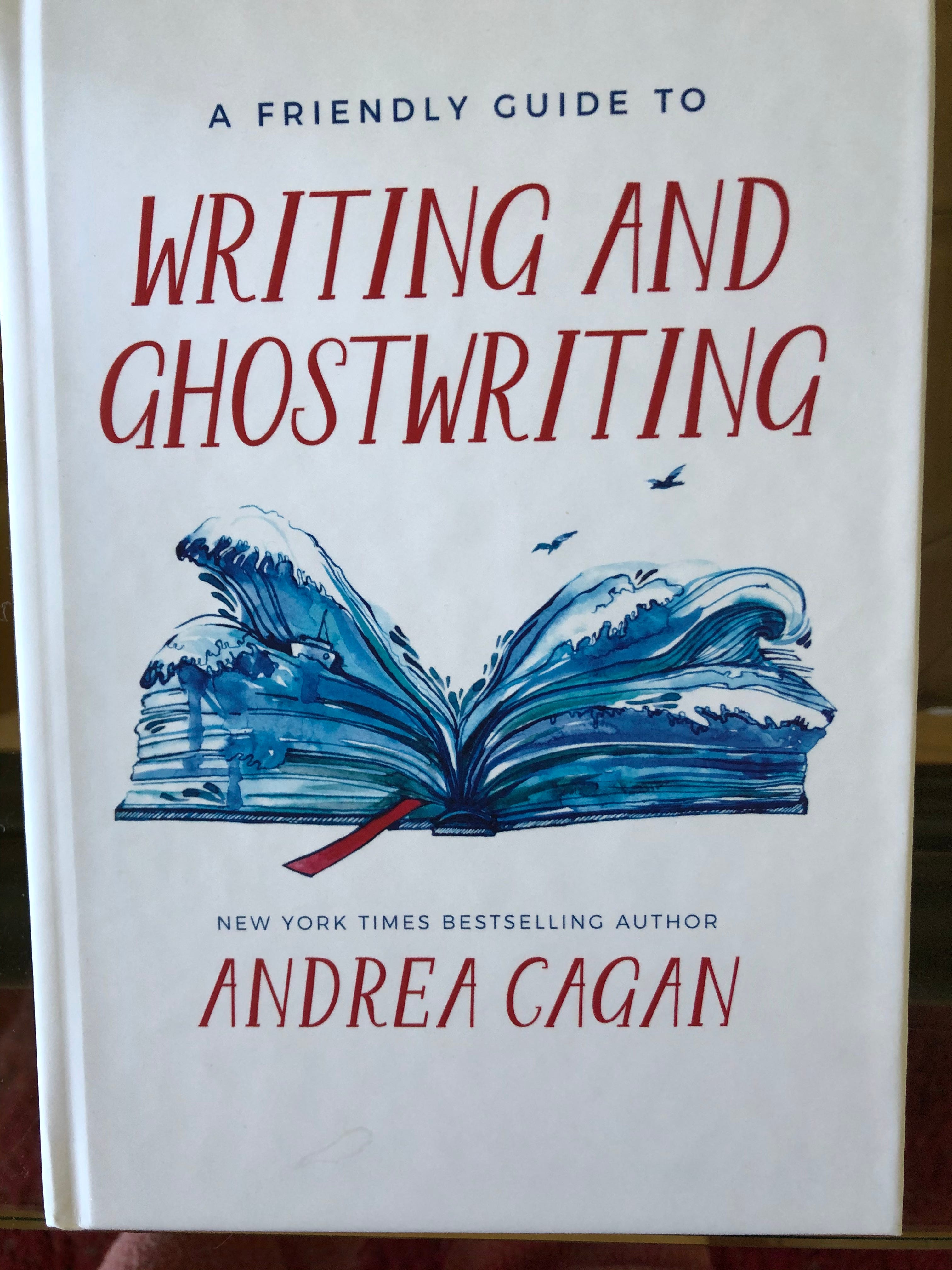
Judging a Book by Its Cover

The saying “never judge a book by its cover” was created by a lazy author who didn´t give much thought of what really works in the marketing of both fiction and nonfiction.
- - - Ana Claudia Antunes
Discovering a new book is like making a new friend. Imagine being at a party and glancing from one guest to another. You find that you’re drawn to someone in particular. She’s not necessarily the most beautiful woman in the room, but she has that certain something – an openness, a sparkle in her eye and an allure – that makes you want to know more about her. He’s not necessarily the most handsome man in the room, but you feel drawn to his wide smile and the way his lip curls when he laughs. Whether or not you develop a friendship will involve deeper investigation, but it usually starts with the face, the first thing you notice.
This is how you want potential readers to react to the cover of your book. It could suggest a tone, a subject, an emotion or a person. Anything that makes someone feel connected to what you’re writing about. You want it to be provocative enough to draw readers in and at the same time, it needs to relate to what’s on the inside. Master painter, Rembrandt, was unsurpassed at using light and shadow to direct a viewer’s eye to a particular part of his painting. In the same way, when readers are looking for a good book, you want them to find a focal point on your cover.
It may seem upside down to create your cover after you’ve written the book, particularly because a reader sees it first, but it’s a good idea to leave it for the end. Sometimes I have something in mind, but it keeps changing as I write. When you contemplate a cover idea for your book, try asking yourself the following:
• Do you like your images and the way the words dance across the background? Or does the cover look crowded with no specific focal point?
• Are the shades of color distinct or do they bleed into each other and disappear? Do they blend or do they clash?
• Will your cover attract a reader or will it confuse and repel?
• Will the artwork make readers want to buy your book or download it onto their e-reader?
When a reader is looking to buy a new book, they evaluate these things in an instant with no forethought. They allow their first impressions to guide them to do the thing we’ve all been advised not to do – judge a book by its cover. How else can you figure out if a particular book is for you? Someone may have penned the Great American Novel, a brilliant memoir or a powerful How-To book, but if the cover doesn't excite a reader and make them curious, they won’t choose it and its shelf life will be short.
I use the following as my guide:
If my cover delights me, it will most likely delight my reader. If it displeases me, it will most likely repel my reader.
It's a good idea to get ideas by studying the covers of other successful books in the marketplace. In 2015, when I was in the process of self-publishing my memoir, I checked online to study covers that other writers had chosen. I considered the imagery, the fonts, the designs and how the color tones blended and complimented each other. I thought about my theme and then I made a decision about my own cover, based on my research. When I had an idea about what I wanted, I hired a designer who was highly recommended and I told her what I wanted.
When you’re choosing a cover artist, a good rule of thumb is to look at what she has already done. Then you can talk to her and decide if you can trust her. Reputable designers are smart, creative and flexible. They should offer several different ideas for mockups and you get to decide which one you want. Or maybe you want something else entirely. It’s up to you, no one is tracking you so you need to carefully choose something that catches your eye. If you get professional advice, listen well so you don't overshoot, overwhelm, underwhelm, confuse your readers, or cause them to be insulted or repelled.
Sometimes the way you visualize the design isn’t how it ends up looking on paper. New York Times journalist David Leonhardt says, “If people don't notice your cover or don't connect with it, the author next to yours will be very grateful.”
I told the artist I chose about the pastels that I envisioned and that I wanted a flowing design. She heard me, she did what I asked her to do and when she sent me a few options, I chose one. I was excited and I tried it out on my “What I’ve Done” page on my website to see how it looked. It didn't take long to realize that next to my other books, the colors on the cover of my memoir were so bland and soft, it virtually disappeared. The artist and I discussed how to alter the design without losing the feeling I wanted. When I replaced the original version with the newer one that had bolder colors, it stood out on my web page beside my other books and I was satisfied.