


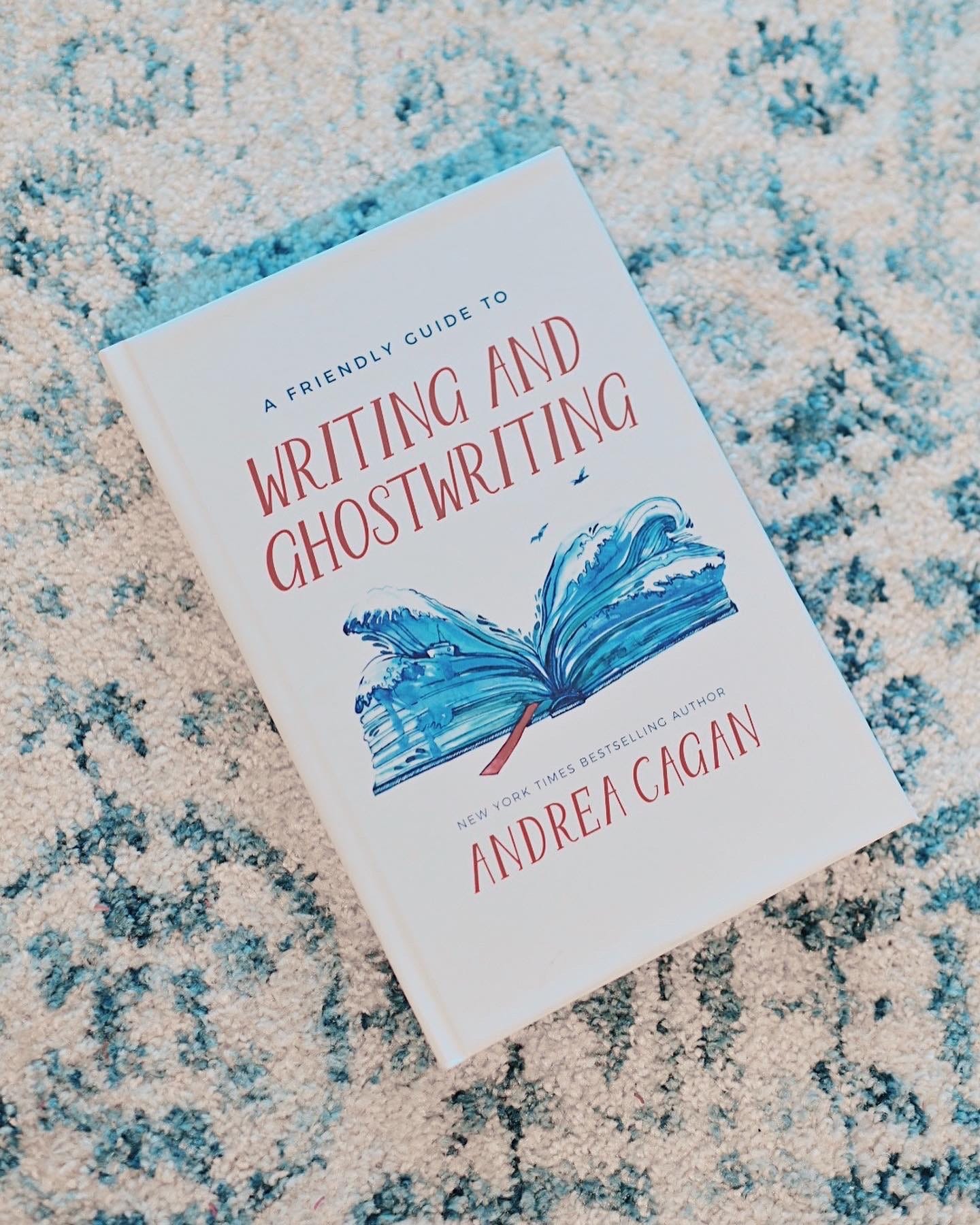
More on: Judging a Book By Its Cover: Excerpt From My Book: A Friendly Guide to Writing and Ghostwriting

It isn't unusual to have a few false starts when you're choosing a cover. No one is perfect out of the gate unless your name is Seabiscuit. Even publishing houses make mistakes. Some years back, after I finished penning Grace Slick’s memoir, she and I were anticipating the cover that her publishing house was creating. But when a mockup arrived with the inscription, “Enjoy,” from the design artist, we were both disappointed. Grace was appalled at the photograph they’d chosen for her. “I look like I have PMS,” she said, “or maybe I’m smack in the middle of menopause.” I agreed that it was a bad choice. The photo looked dull and Grace looked sad, a distortion of who she really was.
For my part, I was upset that they had printed my name, the collaborator, in gray lettering against a black backdrop, as if I didn't exist. They wanted me to disappear into the background and with this cover, they had succeeded. It wasn’t the first time this kind of thing had happened to me, but in this case, I wasn’t a ghostwriter. I was a collaborator. It was in my contract that my name would appear on the cover. I loved the book we’d written, I admired Grace, and I wanted my name to be visible – hardly an unreasonable expectation.
She and I conferred and she told me she was about to call the artist and tell her how she felt. She wanted another cover with a different photo that truly represented her, and she promised to get the lettering of my name changed.
She called me back about twenty minutes later.
“What happened?” I asked her.
“I told her I didn't like the cover,” Grace said, “and she started arguing with me. She told me, ‘I’ve done lots of covers for some very successful books.’ Then she listed them, as if that made my bad cover any better. I told her, ‘Yup, and I’ve recorded lots of albums. Some of them were great and some of them sucked. This cover sucks.’”
The designer reluctantly redid the cover to Grace’s liking and reprinted the lettering of my name.
Confronting the design artist worked for Grace Slick, a fearless, fabulously famous, outspoken woman who is notorious for wielding power, having no filters and saying it like it is. They listened to her and made the appropriate changes, but a publisher won't always do what an author asks. Especially if you’re not a celebrity. When you’re under contract, the hard truth is that legally, the publisher has the final say on all the elements. In essence, they own your book. Still, you need to let them know what you want for your cover. A publisher would prefer to please their writers so they feel good when they go on their book tours. A happy author equals a happy promoter equals strong book sales.
The number of books published each year is growing exponentially so it’s important to make your cover stand out from the multitudes. The right design may not be obvious to you at first, finding it is a process, but don’t give up or settle. Try different options before you choose one. Falling in love at first sight with a particular cover idea can work against you. You may be too close to the project to discern what works and what doesn’t. You’ll just have to put your trust in the publisher and in your intuition to make the right choice and hope for the best.
When you self-publish, you have the freedom to choose your own design. Working with no boundaries may sound like freedom and it is, but it can also be a trap. When you have no one to answer to, when your choices are too broad, you can go wildly off track and you may not know it until the book goes on the market.
Here are some guidelines that can help you choose a cover design that works:
1. Don't overcrowd the cover. If it looks like a mishmash, people won't know where to look. The artwork needs to catch a reader’s eye so they understand immediately what they’re seeing.
2. Choose a font for the lettering that is easy to read. Some fonts are so heavy on italics, serifs and curlicues, it’s hard to make out the words. Script fonts are particularly difficult to read, so be careful. A reader needs to be able to read the title at a glance and remember it.
3. Make sure the colors you choose compliment each other. Are they harmonious or do they looked blurred and disappear? If potential readers are overwhelmed by a kaleidoscopic of clashing colors, if they feel like they're slogging through mud, they’ll shake off their boots and find a clearer path to tread. If the colors are bland or overly loud, it won’t attract anyone.
4. Make sure the front, the back and the spine blend into a solid whole. They are all connected and there should be a flow and a balance that unifies them.
5. Don’t fall in love with your initial vision of the cover or you’ll lose perspective and resist changes that just might make your book more marketable.
If you feel like you can’t make an objective evaluation of the art work, instead of looking outward for approval, try following the advice I once got from a top literary agent:
“Imagine yourself as every reader. Pretend the book was written by someone else. Notice what draws you in and what pushes you away. Be ruthless.”
Makeup artists advise that if you want to draw attention to a bright red lip, soften your eyeliner. If you want a bold eye that will stop people in their tracks, use a neutral lipstick. Similarly, don't allow the cover art of your book to be at war with itself. If the background is busy, make the lettering clear and simple. If the lettering is flourished with serifs, use a solid background. Be sure you don’t make any of it look like an afterthought. You spent months writing the book and in some cases it was years, so why would you get impatient and hastily choose a cover that isn't as well thought out as the book? When I feel stuck and can’t seem to make a decision about the cover design elements, the adage, Less is More, usually gets me pointed in the right direction.